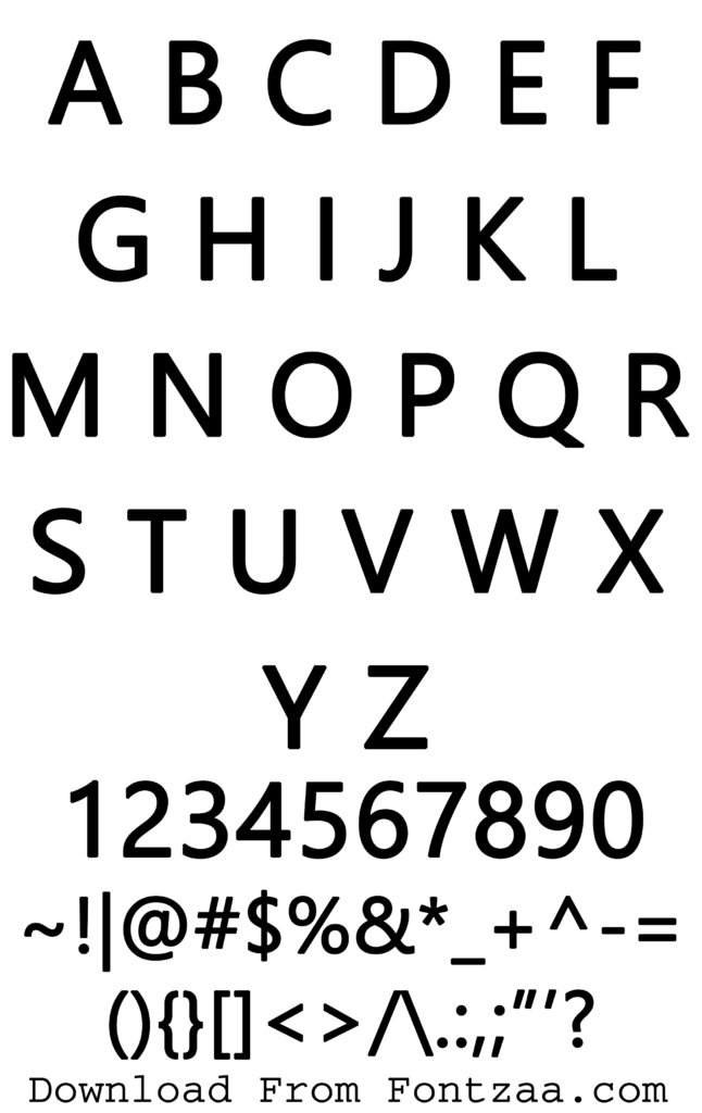
Unlocking the Secrets of Segoe UI: Your Guide to This Popular Font
In the digital age, where visual communication reigns supreme, fonts play a crucial role in shaping user experiences. One font that has become ubiquitous across various platforms is Segoe UI. But what exactly is Segoe UI, and why is it so prevalent? This comprehensive guide will delve into the intricacies of this popular typeface, exploring its history, benefits, and practical applications.
Segoe UI is a humanist sans-serif typeface designed by Steve Matteson and commissioned by Microsoft. Its clean lines and modern aesthetic make it a versatile choice for a wide range of applications, from operating systems and software interfaces to websites and digital documents. The font's legibility and readability across different screen sizes and resolutions have contributed to its widespread adoption.
Understanding the origins of Segoe UI provides valuable context for appreciating its design philosophy. Initially developed as an evolution of the Segoe typeface, Segoe UI was specifically crafted for user interface design. Its subtle curves and optimized spacing enhance its clarity on screen, making it a comfortable choice for extended reading sessions. This focus on user experience has cemented its position as a staple in the digital landscape.
The importance of Segoe UI lies in its ability to create a seamless and consistent user experience. Its widespread use in Microsoft products, including Windows and Office applications, has established a sense of familiarity for millions of users. This familiarity translates into a more intuitive and comfortable interaction with digital interfaces, allowing users to focus on the content rather than the visual presentation.
While Segoe UI enjoys widespread popularity, it has also faced some criticism. One common concern is its perceived lack of distinct personality. Compared to more expressive typefaces, Segoe UI can appear somewhat generic. However, this neutrality is often seen as an advantage in user interface design, where the focus should be on the content rather than the font itself.
Segoe UI was designed in 2004 by Steve Matteson for Microsoft. It quickly became the standard font for Windows Vista and has remained a key component of Microsoft's visual identity ever since.
One of the main benefits of using Segoe UI is its readability. It's designed for clear and comfortable viewing on screens, making it ideal for user interfaces. For example, its use in Windows ensures that menus and dialog boxes are easy to navigate.
Another advantage is its versatility. Segoe UI works well in various sizes and across different platforms. This consistency creates a unified brand experience for users, regardless of the device they're using.
Lastly, Segoe UI offers a modern and professional aesthetic. Its clean lines and contemporary feel make it suitable for various design projects, from corporate websites to mobile apps.
Advantages and Disadvantages of Segoe UI
| Advantages | Disadvantages |
|---|---|
| Excellent readability | Can appear generic |
| Wide platform compatibility | Limited stylistic variations |
| Modern and professional appearance | Overexposure can lead to visual fatigue |
Best Practices:
1. Pair Segoe UI with a contrasting font for headings to create visual hierarchy.
2. Adjust font size and spacing for optimal readability on different devices.
3. Consider using Segoe UI Light or Semibold for variations in weight.
4. Ensure sufficient contrast between the font color and background for accessibility.
5. Test the font rendering on different browsers and operating systems.
Frequently Asked Questions:
1. Is Segoe UI free to use? It depends on the usage context; check the licensing agreement.
2. Can I use Segoe UI for my website? Yes, if you have the appropriate license.
3. What is the difference between Segoe UI and Segoe WP? They are different fonts with distinct characteristics.
4. How can I download Segoe UI? It typically comes pre-installed with Windows.
5. Is Segoe UI suitable for print design? While primarily designed for screens, it can work in print.
6. What are some good font pairings for Segoe UI? Roboto, Open Sans, and Lato are popular choices.
7. How do I embed Segoe UI in a website? You can use CSS @font-face rules.
8. Where can I find the Segoe UI font family? It is available through Microsoft.
Tips and Tricks: Explore font pairing resources to find complementary fonts for Segoe UI. Experiment with different font weights and sizes to achieve the desired visual impact. Test your designs on various devices to ensure consistent rendering.
In conclusion, Segoe UI stands as a testament to the importance of thoughtful typeface design in shaping user experiences. Its widespread adoption is a testament to its readability, versatility, and modern aesthetic. While it may face some criticism for its perceived lack of uniqueness, its neutrality often serves as a strength in user interface design. By understanding the nuances of this popular font, designers and developers can leverage its strengths to create engaging and accessible digital experiences. Whether you're designing a website, developing a mobile app, or crafting a document, Segoe UI offers a reliable and versatile solution for achieving clarity and consistency in your visual communication. As you embark on your next design project, consider the benefits of Segoe UI and how it can enhance the user experience. Explore its potential and unlock its power to create impactful and engaging digital content. By carefully considering its strengths and limitations, you can harness the power of Segoe UI to create compelling and user-friendly interfaces.
Dive into diy unleash your creativity with free printable mermaid pictures
The allure of belly dance on tiktok a cultural phenomenon
Beyond au revoir the charm of a bientot en creole reunionnais


