Elevate Your Google Slides: A Guide to Choosing Stunning Fonts
In the world of digital presentations, first impressions are everything. While compelling content is king, the visual appeal of your Google Slides can make or break your message. One often overlooked element that can dramatically enhance your slides is the choice of font. The right font can elevate your presentation from bland to brilliant, capturing your audience's attention and leaving a lasting impact.
Think about it: a well-chosen font can convey professionalism, creativity, or excitement, even before you utter a single word. Conversely, a poorly chosen font can make your presentation appear amateurish, confusing, or even dull. So, how do you navigate the vast world of fonts and select the ones that will truly make your Google Slides shine?
This is your guide to understanding the power of aesthetically pleasing fonts in Google Slides. We'll delve into the psychology behind font choices, explore popular categories and their impact, and arm you with practical tips to make your next presentation a visual masterpiece.
Imagine sitting through a presentation where the slides are cluttered with text in a font that's difficult to read or feels jarring. Chances are, you'd struggle to focus on the content, no matter how insightful it might be. Now, picture those same slides with a clean, elegant font that complements the message. The difference is undeniable.
Choosing the right font is about more than just aesthetics; it's about creating an experience for your audience. It's about establishing a visual hierarchy that guides their eyes effortlessly through your content. It's about reinforcing your message and leaving a lasting impression.
While the concept of "prettiest" is subjective, there are certain principles of typography that contribute to a font's visual appeal and effectiveness. Factors like readability, clarity, spacing, and overall style all play a role.
Advantages and Disadvantages of Different Font Choices
| Font Style | Advantages | Disadvantages |
|---|---|---|
| Serif Fonts (e.g., Times New Roman, Georgia) | Classic, traditional, good for long-form text | Can appear formal or outdated in modern presentations |
| Sans Serif Fonts (e.g., Arial, Helvetica, Open Sans) | Clean, modern, highly readable on screens | Can feel generic if overused |
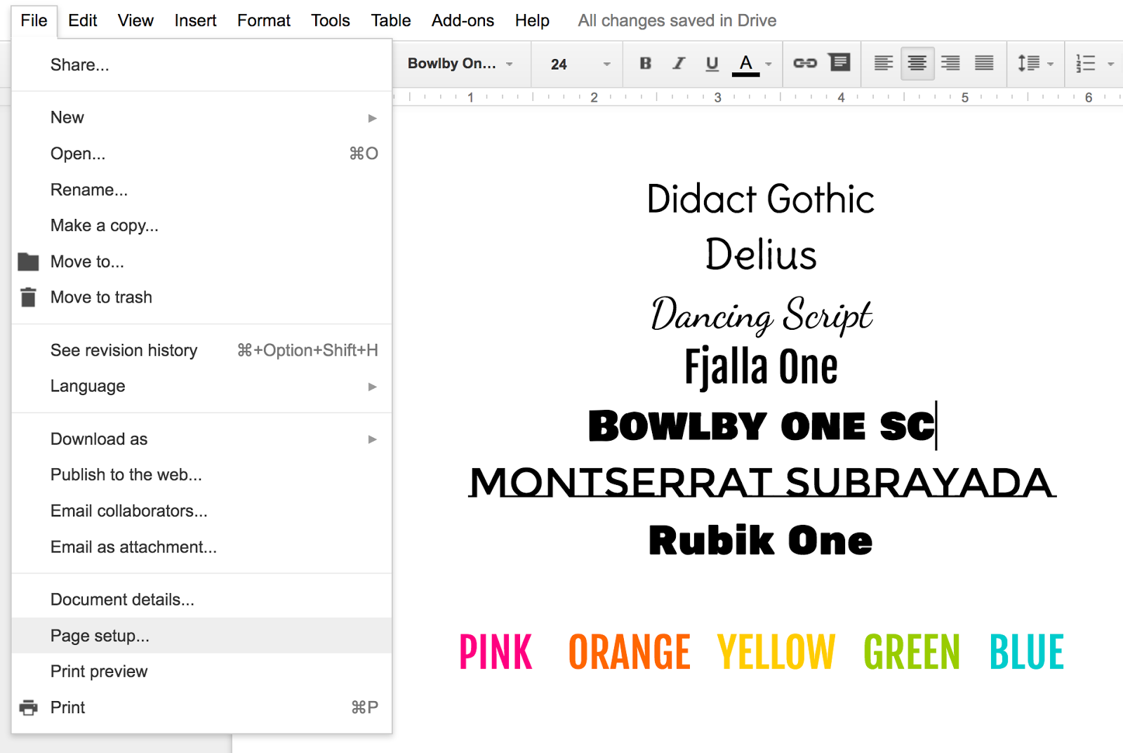
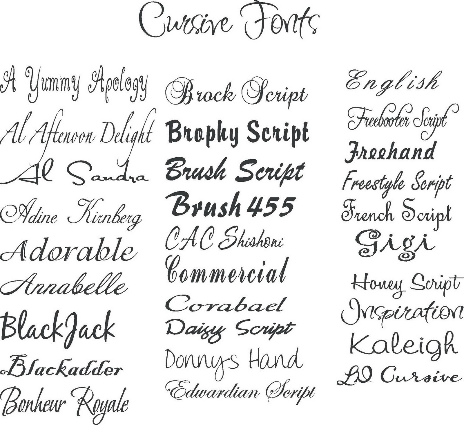
| Script Fonts (e.g., Pacifico, Lobster) | Elegant, decorative, good for titles and accents | Can be difficult to read in large amounts |
| Display Fonts (e.g., Impact, Playfair Display) | Bold, attention-grabbing, good for headlines | Best used sparingly; can be overwhelming |
Best Practices for Choosing and Using Fonts in Google Slides:
- Prioritize Readability: Your audience should be able to easily read your slides from a distance.
- Limit Font Choices: Stick to 2-3 different fonts in your presentation to maintain a cohesive look.
- Create Contrast: Use different font sizes and weights to create visual hierarchy. For example, use a larger, bolder font for headlines and a smaller, lighter font for body text.
- Match Font Style to Your Topic: A playful script font might be perfect for a lighthearted presentation, while a clean sans-serif font would be more appropriate for a professional report.
- Test Your Fonts: Before finalizing your presentation, view it in presentation mode to ensure the fonts look good on a larger screen.
Frequently Asked Questions about Fonts in Google Slides:
1. Can I use fonts that are not installed on my computer in Google Slides? Yes, Google Slides has a vast library of fonts available within the platform.
2. How do I add new fonts to Google Slides? You can add new fonts by clicking on the font dropdown menu in the toolbar and selecting "More Fonts."
3. What are some good font pairings for Google Slides? Some popular font pairings include:
- Playfair Display (header) & Open Sans (body)
- Raleway (header) & Roboto (body)
- Oswald (header) & Lato (body)
4. What is the best font size for Google Slides presentations? Use a font size of at least 24pt for body text and larger for headings to ensure readability.
5. Should I use all caps for my headings? Using all caps can make your headings harder to read. It's best to use a mix of uppercase and lowercase letters for better readability.
6. Are decorative fonts appropriate for professional presentations? Use decorative fonts sparingly and only if they align with the tone of your presentation and brand.
7. Can I embed fonts in my Google Slides presentation? While you can't embed fonts directly, you can download your presentation as a PDF to preserve the font styles.
8. How can I make my font choices more accessible? Choose fonts that are easy to read for people with visual impairments, such as dyslexia. Avoid using overly decorative or stylized fonts that can be difficult to decipher.
Tips and Tricks:
- Use font websites like Google Fonts or Font Squirrel to explore and preview different font options.
- Experiment with different font weights (light, regular, bold) to create emphasis and contrast within your text.
- Pay attention to line spacing and letter spacing to optimize readability.
In conclusion, the fonts you choose for your Google Slides presentations have a significant impact on how your message is perceived. By understanding the principles of typography and following best practices, you can elevate your presentations from ordinary to extraordinary. Take the time to explore different font options, experiment with pairings, and prioritize readability. Remember, the right fonts will not only enhance the visual appeal of your slides but also make your content more engaging, memorable, and impactful. So, embrace the power of beautiful typography and watch your presentations soar to new heights!
Mikes burgers new smyrna beach your go to guide
Beyond happy fathers day a deep dive into felicitaciones por el dia del padre
Stepping stones to a healthier you your guide to wellness


