Decoding 10pt Font: How Big is it Really?
Ever wondered just how big 10pt font appears on paper? It's a common question, especially when wrestling with document formatting, print design, or even choosing the right font size for an email. This seemingly simple query opens a door to a world of typography, design principles, and the nuances of digital versus print media.
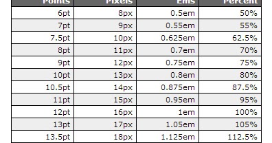
While 10pt font might seem like a standard size, its actual dimensions in inches aren't straightforward. Unlike physical units like inches or centimeters, points are a relative unit of measurement in typography. A point is approximately 1/72 of an inch. Therefore, 10pt font should theoretically be around 10/72 of an inch, or roughly 0.139 inches. However, the actual height of the characters can vary slightly depending on the specific font, its design, and even the software or printer used.
The history of point size dates back centuries to the era of metal type. Printers would physically cast characters in specific sizes, measured in points. This system carried over into the digital age, although the physical constraints of metal type no longer apply. Today, points remain the standard unit for measuring font size, providing a consistent way to describe and control the appearance of text across different platforms and devices.
Understanding font size is crucial for creating effective and accessible documents. Whether you're designing a brochure, writing a report, or simply crafting an email, choosing the right font size contributes significantly to readability and overall visual appeal. Too small a font can strain the reader's eyes, while too large a font can look unprofessional and disrupt the document's flow.
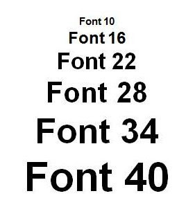
A 10pt font is often considered a standard size for body text in many documents. It offers a good balance between readability and space efficiency, making it a popular choice for books, reports, and other printed materials. However, factors like the font's design, line spacing (leading), and the intended audience should always be considered when choosing a font size.
For example, a simple sans-serif font like Arial at 10pt might appear larger than a more ornate serif font like Times New Roman at the same size. This is due to variations in x-height (the height of lowercase letters) and other design characteristics. Similarly, using a larger leading (the space between lines of text) can improve readability even when using a smaller font size.
One benefit of using 10pt font is its space efficiency. It allows for a reasonable amount of text on a page without making it appear crowded. This is particularly important for longer documents or when working with limited space.
Another advantage is its familiarity. Since 10pt is a common font size, readers are accustomed to it, making the text comfortable and easy to read. This familiarity contributes to a smoother reading experience and helps to avoid distractions caused by unusual formatting choices.
A third benefit is its versatility. 10pt font is suitable for a wide range of document types, from academic papers to business reports, letters, and even some website content.
Advantages and Disadvantages of 10pt Font
| Advantages | Disadvantages |
|---|---|
| Space efficient | May be too small for some readers |
| Familiar and comfortable to read | Less impactful for headings or titles |
| Versatile for various document types | Can appear crowded with insufficient leading |
Best Practices for Using 10pt Font:
1. Consider your audience: Older readers or those with visual impairments may benefit from a larger font size.
2. Pair it with appropriate leading: Increase line spacing to improve readability, especially for longer blocks of text.
3. Choose a legible font: Opt for clear, well-designed fonts that are easy on the eyes.
4. Test your document: Print a sample to ensure the font size appears as expected in the final output.
5. Consider the context: 10pt might be suitable for body text but too small for headings or captions.
Frequently Asked Questions:
1. What is a point in typography? A point is a unit of measurement equal to approximately 1/72 of an inch.
2. Is 10pt font always the same size? The actual height can vary slightly depending on the font and software.
3. What is leading? Leading is the space between lines of text.
4. Is 10pt font suitable for web design? Generally, larger font sizes are preferred for web readability.
5. What is x-height? X-height refers to the height of lowercase letters in a font.
6. How can I change font size in Microsoft Word? Use the font size dropdown menu in the formatting toolbar.
7. How can I change font size in Google Docs? Use the font size dropdown menu in the formatting toolbar.
8. How do I choose the right font size for my project? Consider your audience, the type of document, and the desired aesthetic.
In conclusion, understanding the nuances of 10pt font and its actual size is vital for effective document design and readability. While approximately 10/72 of an inch, the visual appearance can be influenced by various factors. By considering best practices, such as choosing appropriate leading and legible fonts, you can leverage the versatility and familiarity of 10pt font while ensuring a comfortable and accessible reading experience. Remember to always prioritize your audience and the specific context of your project when making design choices. Experiment with different fonts, sizes, and leading to find the optimal balance for your needs. By paying attention to these details, you can elevate the quality of your documents and create a more engaging and impactful reading experience for your audience. This attention to detail not only demonstrates professionalism but also ensures that your message is effectively communicated.
Stretch your budget further save a lot ontario new york
Exploring the digital wilderness a guide to finding the wild robot online
Unlocking the power of the instagram symbol


