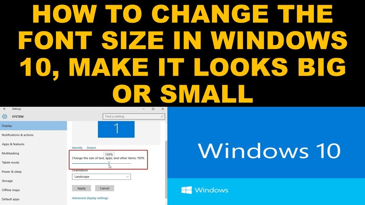
Deciphering Resume Font Sizes: Is 10 Point Too Small?
You've poured your heart and soul into crafting the perfect resume, meticulously highlighting your skills and experience. But amidst the careful wording and strategic formatting, a nagging question lingers: Is size 10 font too small? This seemingly minor detail can significantly impact how recruiters perceive your application, so let's delve into the nuances of resume font sizes and find the sweet spot for readability and professionalism.
Choosing the right font size for your resume is a balancing act. Too small, and you risk straining the recruiter's eyes, potentially leading them to overlook key information. Too large, and your resume may appear cluttered and unprofessional. Finding that "just right" size is crucial for ensuring your resume makes a positive first impression.
While there's no hard and fast rule, a font size smaller than 10 points is generally considered too small for a resume. Recruiters often spend mere seconds scanning each application, and a tiny font size can make this quick review difficult, potentially landing your resume in the "reject" pile. Aiming for a font size between 10 and 12 points is typically recommended for optimal readability.
The importance of readability cannot be overstated. Your resume is a marketing document, designed to showcase your qualifications and persuade the recruiter to invite you for an interview. If your resume is difficult to read, the recruiter may simply move on to the next application, regardless of how impressive your experience might be.
Beyond the numerical value of the font size, other factors contribute to overall readability. Font style, line spacing, and margins all play a role. Pairing a clean, professional font like Calibri or Arial with adequate line spacing and margins creates a visually appealing and easy-to-read document. This holistic approach ensures your resume stands out for the right reasons.
Historically, smaller font sizes were sometimes used to cram more information onto a single page. However, with the increasing prevalence of digital resumes and applicant tracking systems (ATS), this strategy is no longer necessary or advisable. ATS can easily parse multi-page resumes, so prioritize readability over squeezing everything onto one page.
Benefits of Choosing an Appropriate Font Size:
1. Enhanced Readability: A larger font size (10-12pt) makes it easier for recruiters to quickly scan and absorb the information on your resume, increasing the chances of your qualifications being noticed.
2. Professional Appearance: Using a suitable font size contributes to a polished and professional look, demonstrating attention to detail and respect for the reader's time.
3. Improved Accessibility: A larger font is more accessible for individuals with visual impairments, promoting inclusivity and demonstrating consideration.
Best Practices for Resume Font Size:
1. Stick to 10-12 points for body text.
2. Use a slightly larger font size (14-16 points) for your name and section headings.
3. Choose a clean, professional font like Calibri, Arial, Times New Roman, or Georgia.
4. Ensure adequate line spacing (1.15 to 1.5) and margins (at least 0.5 inches).
5. Test your resume's readability by printing it out and reviewing it from a distance.
Advantages and Disadvantages of Size 10 Font
| Advantages | Disadvantages |
|---|---|
| Can fit more information on a page (though not recommended) | Can strain the reader's eyes |
| May appear more compact | May appear unprofessional or cluttered if other formatting elements are not carefully considered |
Frequently Asked Questions:
1. Is size 10 font ever acceptable on a resume? While generally discouraged, size 10 font might be acceptable if you're using a particularly large font style and have ample white space.
2. What is the best font size for a resume header? 14-16 points is generally recommended.
3. Should I use the same font size throughout my resume? No, use a slightly larger size for headings.
4. Does font size matter for digital resumes? Yes, readability is crucial regardless of the format.
5. How can I check my resume's readability? Print it out and review it from a distance.
6. What are some good font choices for a resume? Calibri, Arial, Times New Roman, and Georgia.
7. Can I use decorative fonts on my resume? Generally, it's best to avoid them for professional documents.
8. What if I need to fit my resume onto one page? Prioritize readability over cramming everything onto a single page. Consider reducing content rather than shrinking the font size excessively.
In conclusion, while the question of whether size 10 font is too small for a resume might seem trivial, it can significantly impact your chances of landing an interview. By prioritizing readability and adhering to best practices, you can ensure your resume makes a strong and positive impression on recruiters. Opting for a font size between 10 and 12 points, combined with a clean font, appropriate line spacing, and ample margins, creates a visually appealing and easy-to-read document. Remember, your resume is your first impression – make it count by presenting your qualifications in a clear, concise, and professional manner. Take the time to carefully consider your formatting choices, ensuring your resume stands out for all the right reasons. Don't let a small font size overshadow your big potential!
Elevate your designs the power of a light blue splash png
Anime background wallpaper pc gif level up your desktop aesthetics
Victoria plumb tiles uk your bathrooms cry for help or chic design choice


